Pacific Blue Cross

I collaborated on the experience design phase of the client facing website, travel insurance purchase flow, and benefits management portal for one of Canada’s largest insurance providers. I also led the design of an overarching design system for future scalability.
Role
Visual Design Lead,
User Experience Designer
Agency
Domain7
Client
Pacific Blue Cross
Year
2016-2019
For Pacific Blue Cross, Canada’s #1 provider of health benefits, I collaborated on design with the Domain7 team through a people-focused digital transformation project that resulted in a revitalized website, travel insurance purchase flow, and a transformed member benefits experience.
A major investment in UX and vision alignment guided the design and development process through to launch.
PBC approached Domain7 with a the initial goal of ‘Reducing Paper’.
The large amount of paper claims that were processed daily had become a large challenge for the organization and their members. This was an opportunity to embrace digital and streamline their member experience.


I was onboarded to our internal team to collaborate as an experience designer, as well as lead visual design throughout the project.
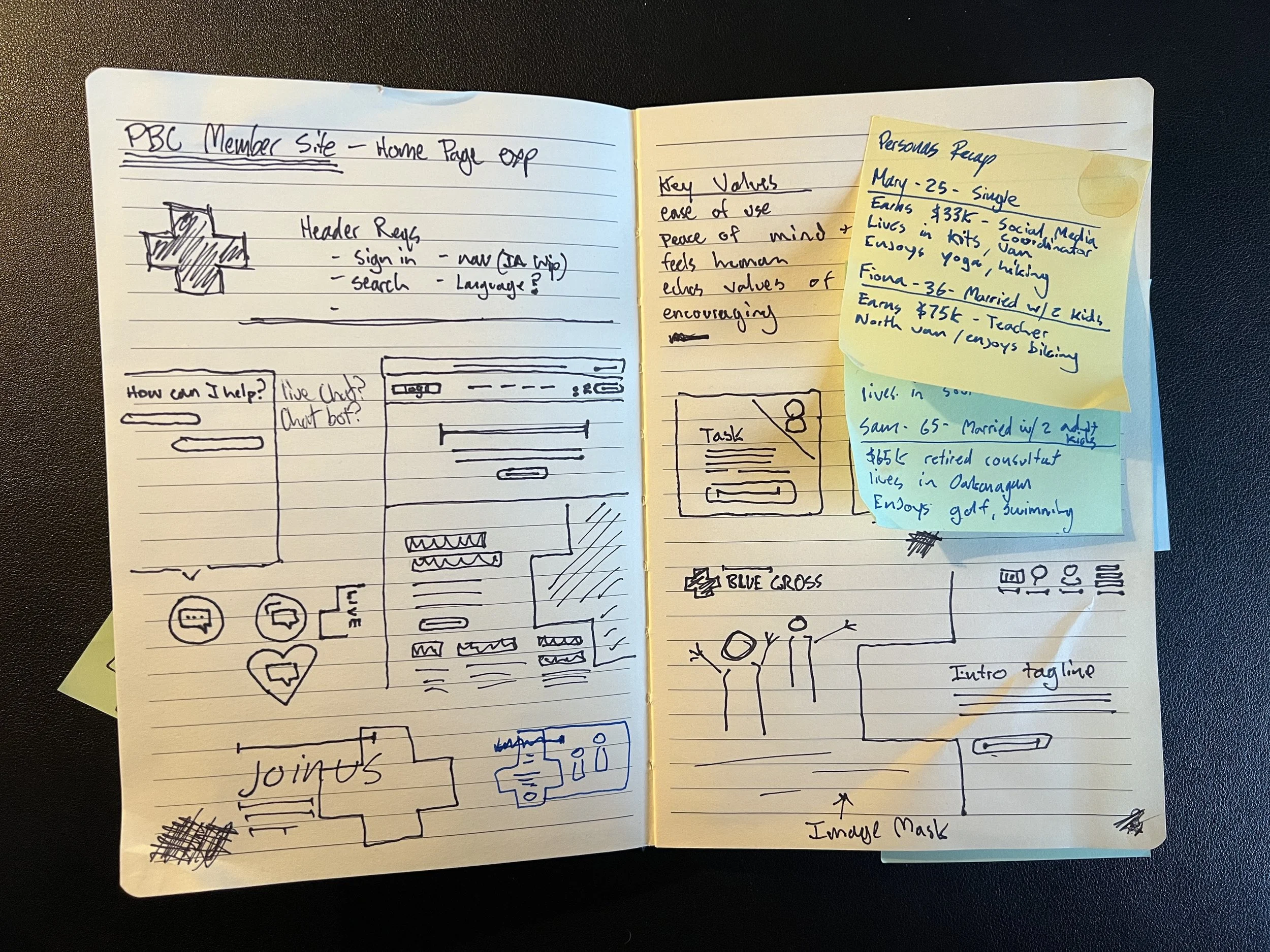
Early research and workshops were used to define the project scope, discover the needs of the organization, conduct competitive reviews, and learn how much PBC knew about it’s members and how members engage with them.

These activities highlighted the need for a modern public facing website to reflect the level of service they strive to give members.
Second, but also just as important was building a portal to allow members to access and manage their claims and benefits.


PBC’s corporate site was the public face of the organization and needed to reflect the high level of service they expect to give their customers.
My approach to the corporate site was delivering a design that reflected the beauty of good health and a good life, and showcases the ways PBC strives to help their members with brilliant care.
Looking to information synthesized in our early discovery, and with IA in hand I started with low fidelity wireframes. We were able to build a few key pages in desktop view to help test some pathways we had highlighted as important.
Testing was conducted remotely on the homepage prototype wireframes.
Through testing we asked users to perform tasks such as:
“Imagine you’re self-employeed and exploring options for health benefits, where on the site would you go to find this information?”
“As a current member with a basic health care plan, you are looking for information on adding life insurance to your policy, where would you expect to find this information?
“You are planning a trip and are looking for tips and advice on travelling safely...”
“You’re a small business owner who has never provided benefits to your employees, you are looking for information on offerings from PBC specifically for small businesses...”
From the testing phase we were able to gather quite a few insights into the ways users were navigating the prototypes, such as preference for search, looking for key tasks in or around the hero, and preferring to see high-level over views of offerings on the homepage.
Data gathered here also helped inform minor changes to the proposed IA, as well as content strategy.

Moving on from the presented and approved wireframes, I switched my attention to the visual design of the site.
PBC had recently made some updates to their visual identity system that needed to be reflected in the new site.
Wide open content areas and large, focused imagery was used to invite members and potential members to explore who PBC is and how they can help them in way that felt inviting and avoided any typical corporate design stereotypes.
Special attention was given to the hero section of the homepage as a way to bring video into the frame of the PBC cross and give life to the page immediately.

Alongside the corporate site I designed a broad, scaling design system that would allow PBC to carry a consistent design vision forward into new products in the future.

Purchasing travel insurance was another key area in which I was involved in the design process. Travel insurance can typically be a complex thing to purchase. Lots of questions, upsells, and overwhelming interfaces can make it difficult for a lot of users, forcing them to waste valuable time before a trip.
The new design system I created allowed our team to create an engaging, clear, and hassle-free way to purchase a travel insurance policy.
I designed and tested key areas of this flow, such as solutions for a bar at the bottom of the browser that gives a user a running tally of their estimated costs based on the answers they input throughout the process, eliminating any surprises that may come once they’re finished filling out their information.

The addition of 3D imagery and photography was used to give visual rest to form elements and heavy text. This also served as an opportunity to pull out and highlight upsell products or add-ons to your trip policy that felt natural and less pushy.

The final portion of the project was the backend member profile. PBC relied on several large technical systems to handle claims and member benefits in the past.
To tackle this challenge required collaboration with Domain7 and PBC’s technical teams.
As a design team we needed to map out how this new portal would integrate both with the pages and content from the corporate site we created as well as an existing legacy submission tool.

Applying and adapting elements from the design system we were very quickly able to build out a portal that served to give members ease of access to submitting claims, learning about their coverage, managing health spending accounts, and exploring member specific benefits and additional products.
Takeaways from testing had us make a few changes to the portal:
Help our members become more aware
Speak a simple, member focused language
Educate members
Change members behaviors incrementally

I spent time refining card styles and optimizing the layout of this membership portal through rapid prototyping and feedback sessions and visual tests on elements such as the floating “submit a claim” button to optimize ideal placement, icon, button shape, and copy.
